r/Handwriting • u/evil-rick • 1d ago
Feedback (constructive criticism) Looking for advice on the ‘drop letters.’
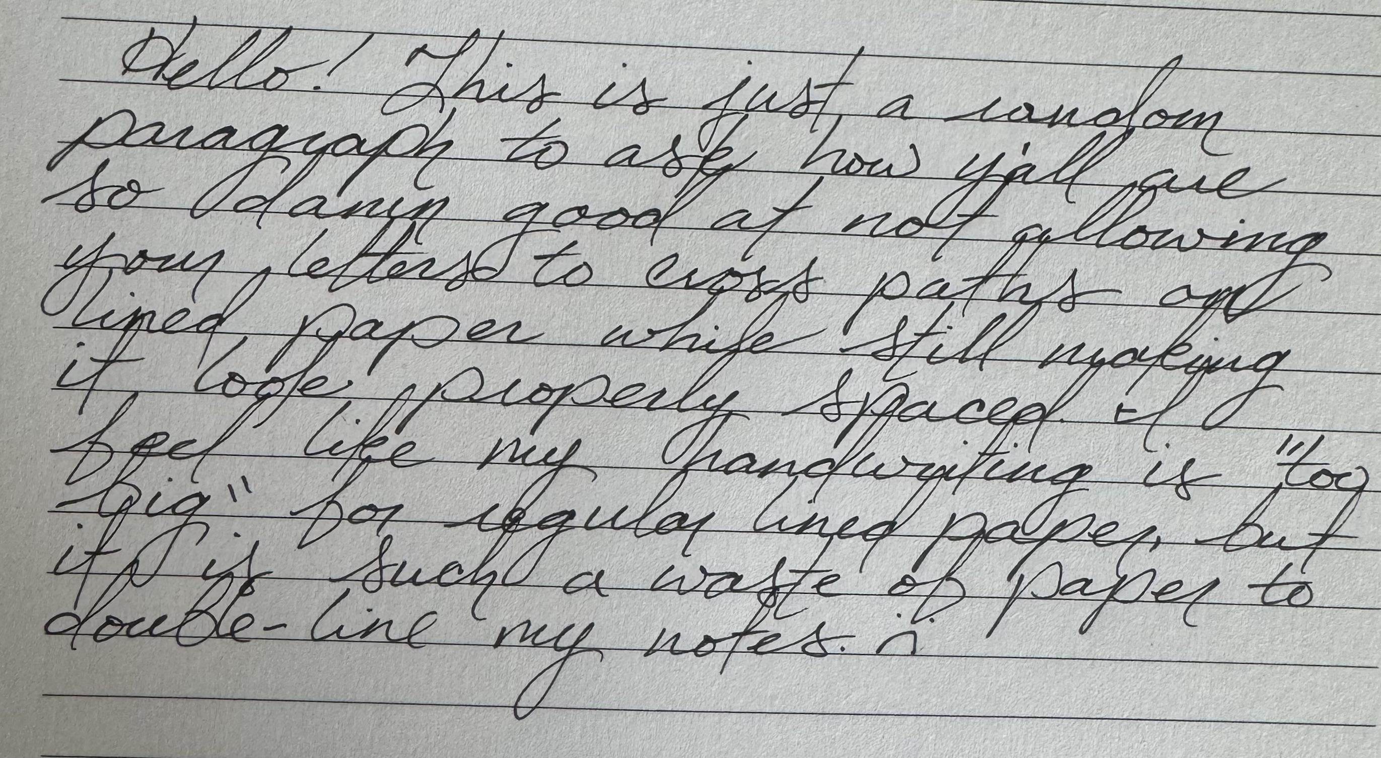
So I notice that a lot of y’all manage to keep your hanging letters from intersecting with your bottom words. I obviously have a bigger handwriting style but I struggle to keep things from intersecting. I’m sure I have other things to work on as well but I really wanna focus on getting my lines from blending together.
1
u/Opposite_Prompt3297 14h ago
Your handwriting looks good to me! I think it depend on the personality and habitus of the writer. When looking at graphology we see how it's really a reflection of who you are.
1
2
u/windy_lizard 1d ago
Well, it's hard to keep your drop letters from interfering with the rest of the letters. You can try to 'time' the spacing so the drop letters fall into neutral spaces, or just accept that it's going to happen where drop letters will interfere with the tall letters sometimes. If your handwriting is good, there will be minimal true interference.
•
u/AutoModerator 1d ago
Hey /u/evil-rick,
Make sure that your post meets our Submission Guidelines, or it will be subject to removal.
Tell us a bit about your submission or ask specific questions to help guide feedback from other users. If your submission is regarding a traditional handwriting style include a reference to the source exemplar you are learning from. The ball is in your court to start the conversation.
If you're just looking to improve your handwriting, telling us a bit about your goals can help us to tailor our feedback to your unique situation. See our general advice.
I am a bot, and this action was performed automatically. Please contact the moderators of this subreddit if you have any questions or concerns.